Submitted by Caitlin on
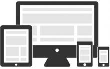
We are deep, deep into an era of mobile technology. People use the internet not just on their computers, but also on their phones, tablets, e-readers, video game devices and more - and sometimes they use these devices more than an actual computer. This is something to consider when designing your website: each of these devices has a different screen size and resolution. Something that looks beautiful on a horizontal 25" desktop monitor could be disastrous on a vertical 5.5" phone screen. Which brings us to responsive design.
Responsive web design is simply your webpage recognizing what device is being used to access it, and adjusting its design to best suit that device. If you've ever browsed the mobile version of a website, you've seen what responsive web design can do. It's the difference between allowing your visitors to comfortably access your website, and potentially frustrating them by forcing them to zoom and scroll all over the screen.
Keep this in mind when you work with a web designer or craft your own website. It reflects well on you and your brand to appear flexible and on top of current technology trends. As more and more mobile devices appear on the market, your customers will want more and more ways to access you.